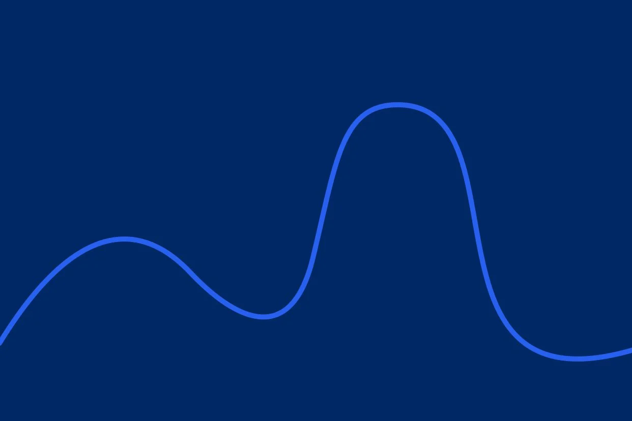
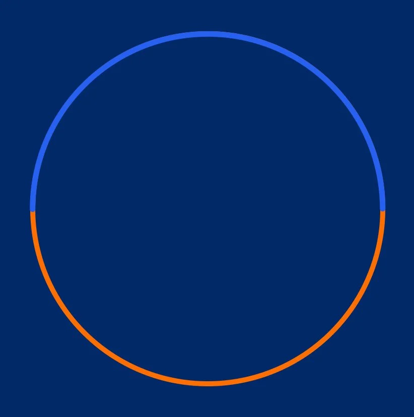
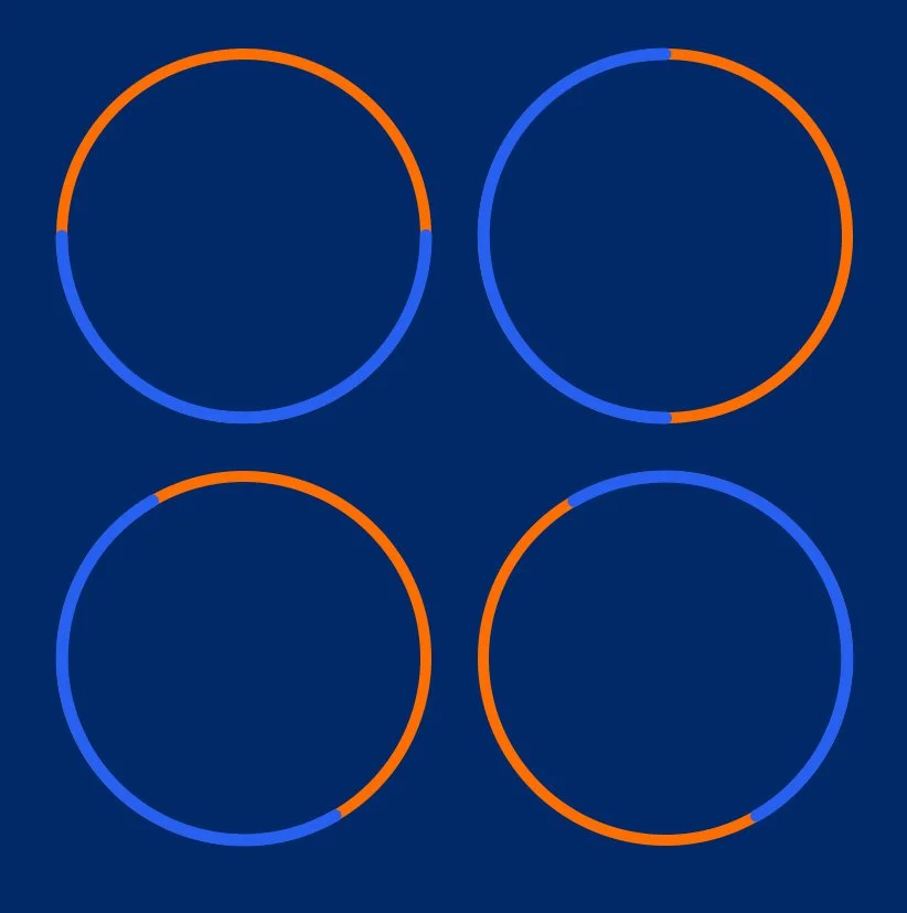
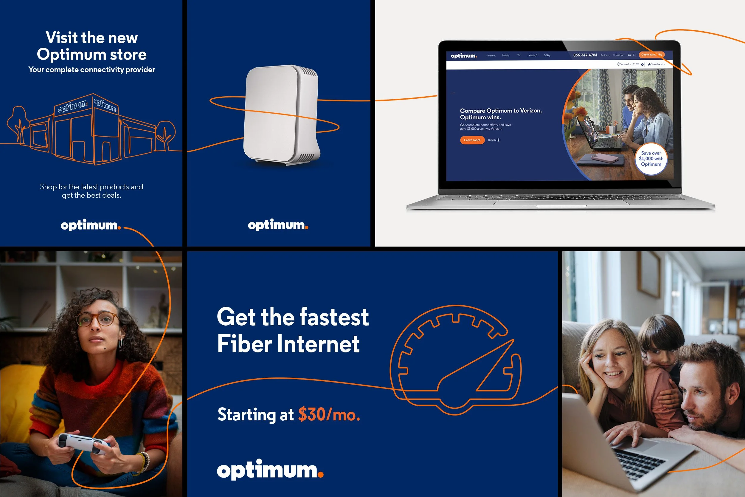
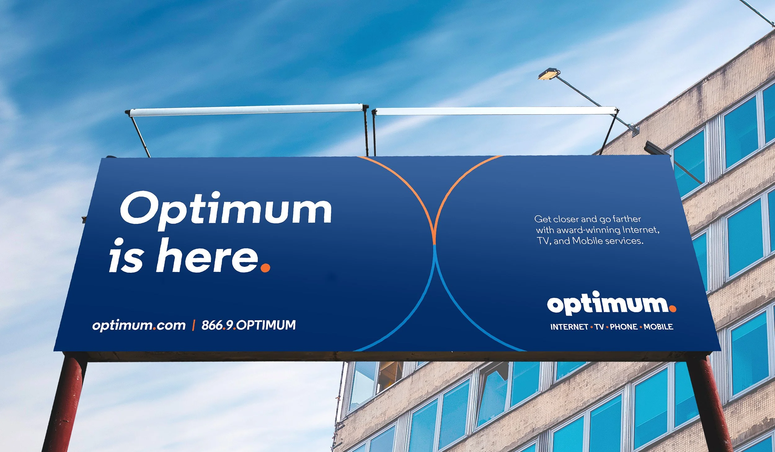
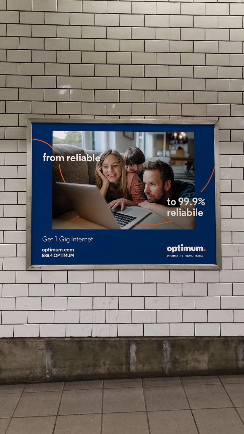
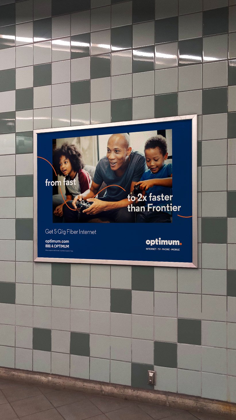
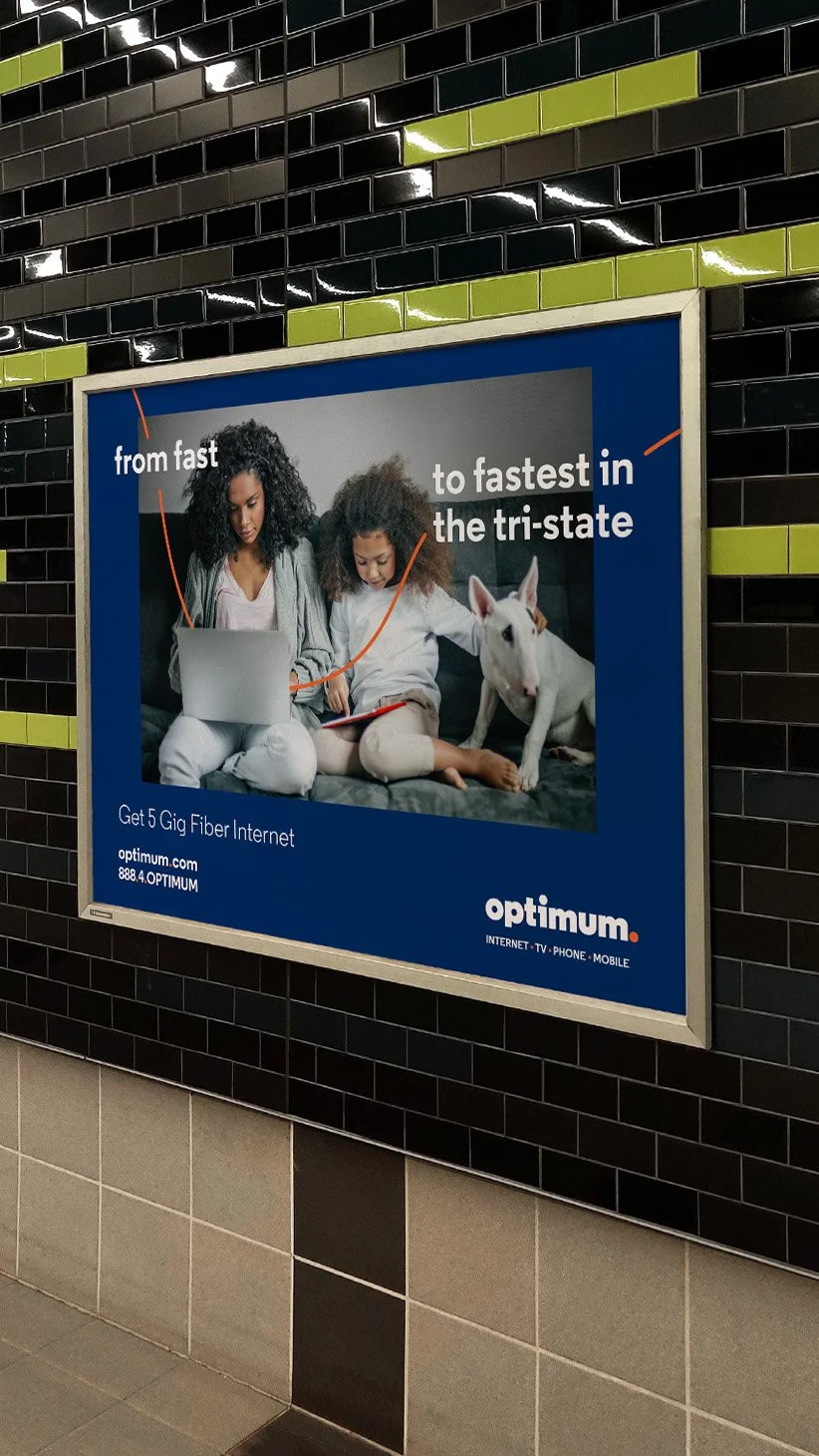
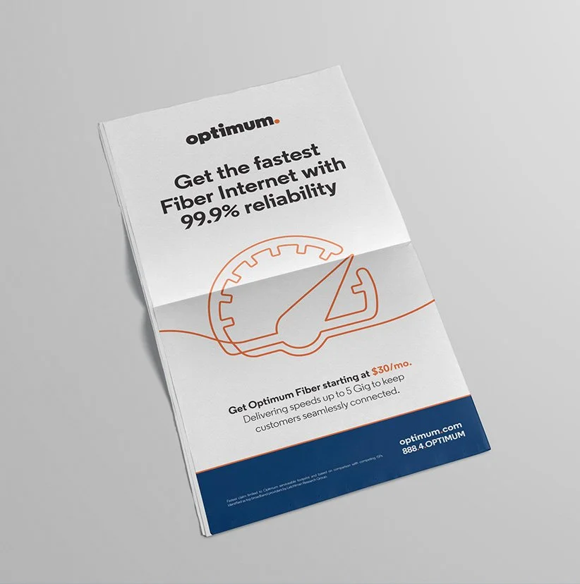
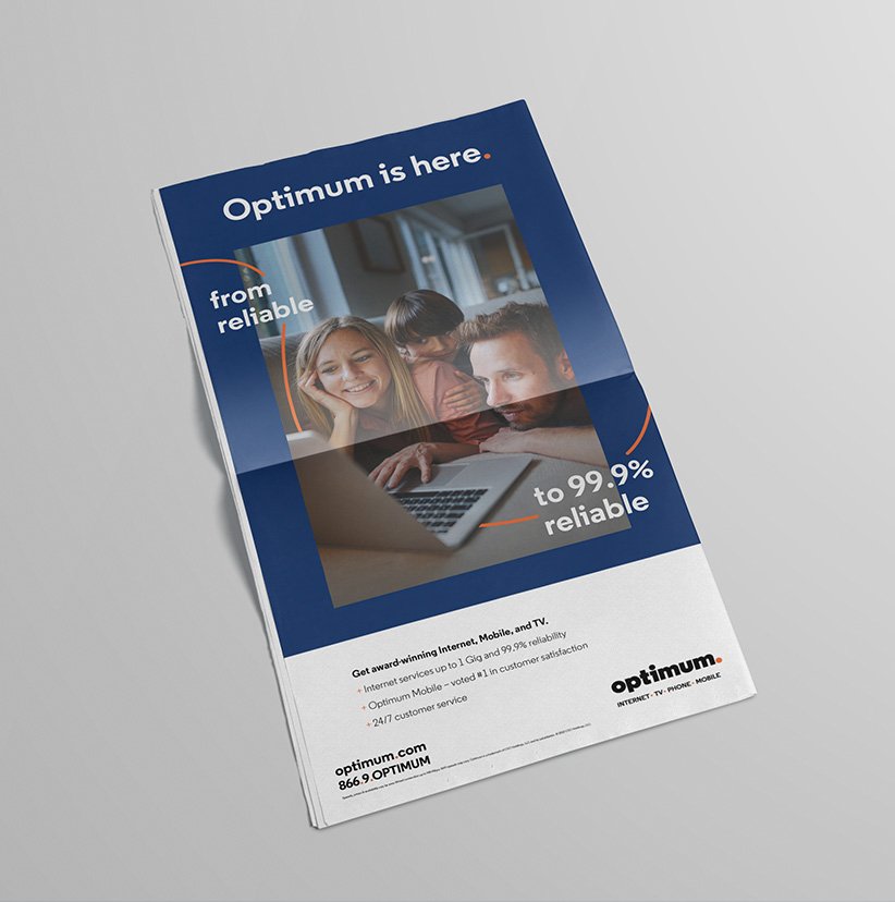
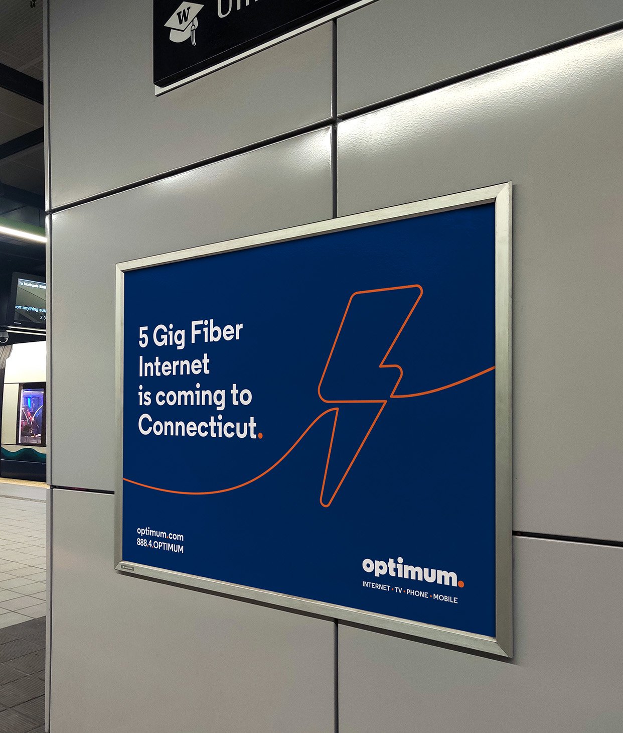
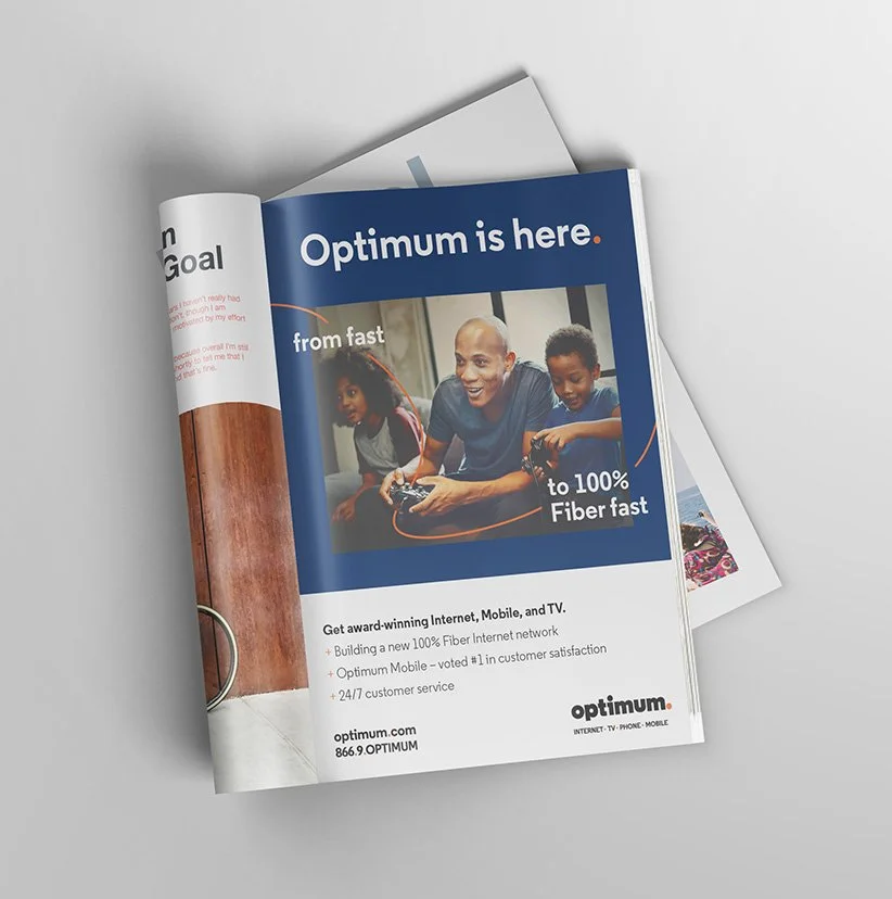
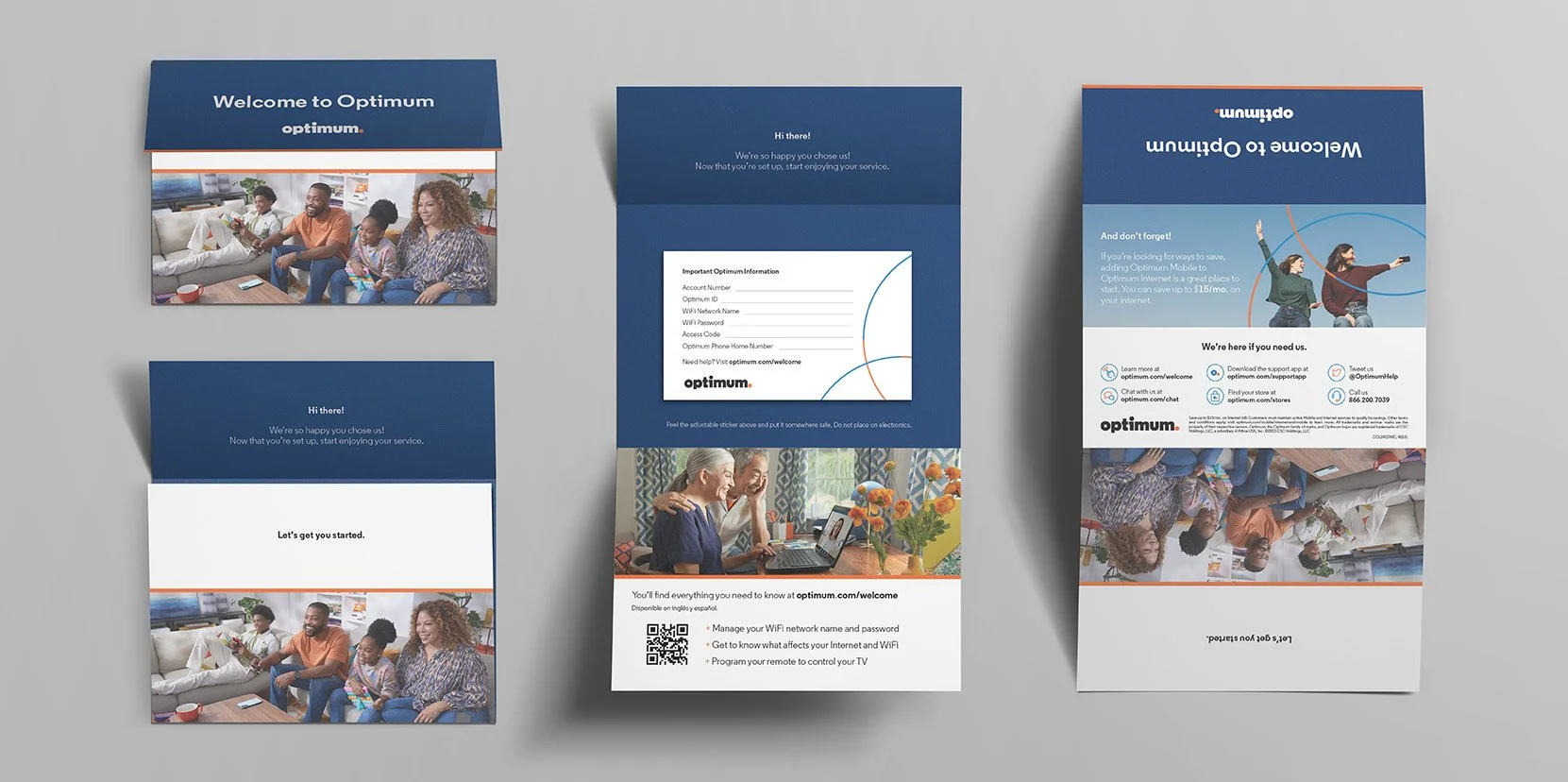
Our design features Optimum's new primary brand colors of blue and orange, bringing energy and warmth to the palette. The dynamic line, created with orange and energy blue threads, forms line illustrations and a "connection ring" in the shape of a circle, representing the intertwined relationship between the customer and Optimum's commitment to better service. These threads signify motion and connection, whether used interactively over photography or to create line illustrations. They can also flex to form a perfect circle, illustrating connection in more conservative executions where the threads cannot exist freely. The thread system has three primary applications: interaction, organization, and illustration, using both threads and connective rings to cater to various execution types and requirements.
"Get closer, go farther" emphasizes unity and progress through a simple yet effective visual language.


